How to Find Your Spring Colour Palette
What’s more interesting than watching paint dry? Nothing, we say. Sometimes, there is nothing more rewarding, especially if you can see the way paint shapes and forms your room, and upgrading your spring colour palette can improve your overall mood. Settle down with a cup of tea and read on to find out how you can transform your space for spring with just a lick of paint with our spring colour trends of 2021.
Going Green
It can be so refreshing to feel like you are bringing the outside in, and if you love walking, nature and the open air, then this one's for you. The soft, sage greens seem to be doing the neutral rounds at the moment, so if you love subtlety in your home, green is slowly starting to replace all that grey we have been seeing, as it takes us on a whirlwind journey of the great outdoors. Green is definitely the dark horse of this spring’s interior colour trends.
Farrow & Ball’s Sap Green is a fantastic neutral, full of earthy tones, and one that will look fresh and modern, with its soft yet rich formula.
Not too sure about the colour on your walls? Try using it as an accent colour, paint your bottom kitchen cupboards in the earthy neutral and match it to something wood based, like your dining table legs. Our Oak Top Kitchen Table has a base that can be painted in ‘Sap Green’ or any other Farrow & Ball colour for that matter, to tie in perfectly with the rest of your kitchen or dining space. The shades of grey are gone, but green is here in all its glory.
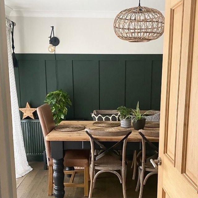
Photo Credit: @our70s_semi
Product: Bentwood Dining Chairs
Pretty Pastels
Cotton candy and heavenly hues are what springs to mind when you think of pastel colours. If you love all things bright, airy and mood boosting, then the pastel colour scheme is right up your street. There are plenty of victorian renovators on Instagram that use their pastel power to reel in the likes, and for good reason. They are making waves across the interior scene. With fresh balmy blues, delicate pinks and gentle yellows and greens that instantly uplift your interior, they can also have a positive effect on your wellbeing.
The range of pastel colours on the market today is something else, and they all work together in perfect harmony. Pantone’s Party Pink does exactly what it says on the tin, it makes you want to celebrate, and enjoy life to the full, which is why it is a harmonious colour that can be plastered all over your walls, ceilings, furniture and floors. The light, sensitive pink can be paired perfectly with the more neutral, paler sister of Party Pink, Silence, which is a cool white with just a hint of a beautiful lavender hue, delicate enough for a neutral ceiling or wall colour with an added extra.
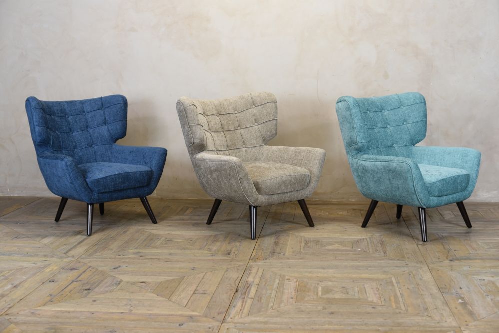
Sunny yellows and aqua are more pastel colours that are sweet talking those long, hot summer days out of hibernation, and are very easy pastel colours that can be added to your interior. Our best-selling Arlo Accent Chair in Lagoon Linen is a great homage to pastel, makes you think of your favourite coastal holidays with just a hint of cloud.
Powerful colours
The transcendent inky blue and mulberry tones are the heavyweights of this spring's interior paint colour trends, so if bright colours and neutrals aren’t your thing, have no fear, as the darker, romantic colours are still doing the rounds this season, delivering positivity and improving our productivity.
There is one colour in particular that plays a very important part in this year’s spring colour palette: Epoch by Graham and Brown. It is still causing a scene across the interior community, and although it is a dark, robust colour for wintery evenings, it can be scaled back and paired with lighter, warmer colours to bring a fresh, new, original take on colours you may have already sprinkled into your space during the winter months. Love the colour but prefer a completely neutral interior? Add some beautiful purple hydrangeas or red eucalyptus to bring a summery ambience to your interior without it feeling overwhelming.
An inky blue hue is another colour that can be adapted for more neutral interiors, and the striking pop of colour will add true authenticity to your space. Our Rosette and Bronte stools can be found in the dominant shade of Midnight Blue, a fantastic accent colour for kitchens and home bars. These empowering colours bring a calming, soothing effect to the atmosphere in your home.
We believe in originality and we believe that all individuals can be whatever they want to be, so we hope that this blog inspires you to find your own shades of blue, explore all your options and develop your own spring colour palette, so you can find your own way home with Peppermill.
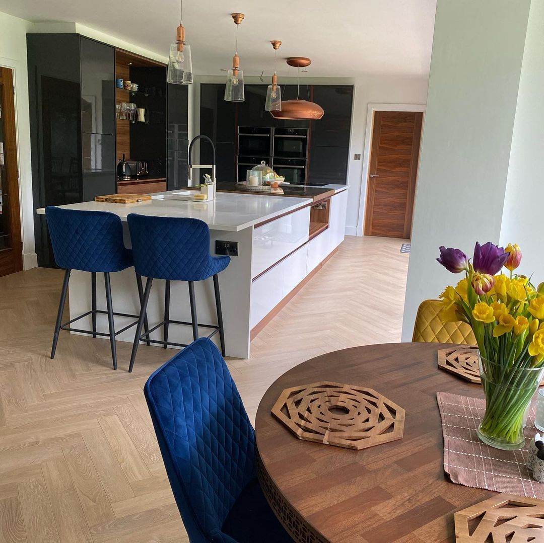
Photo Credit: @mehimandhome
Product: Midnight Blue Velvet Bronte Stool